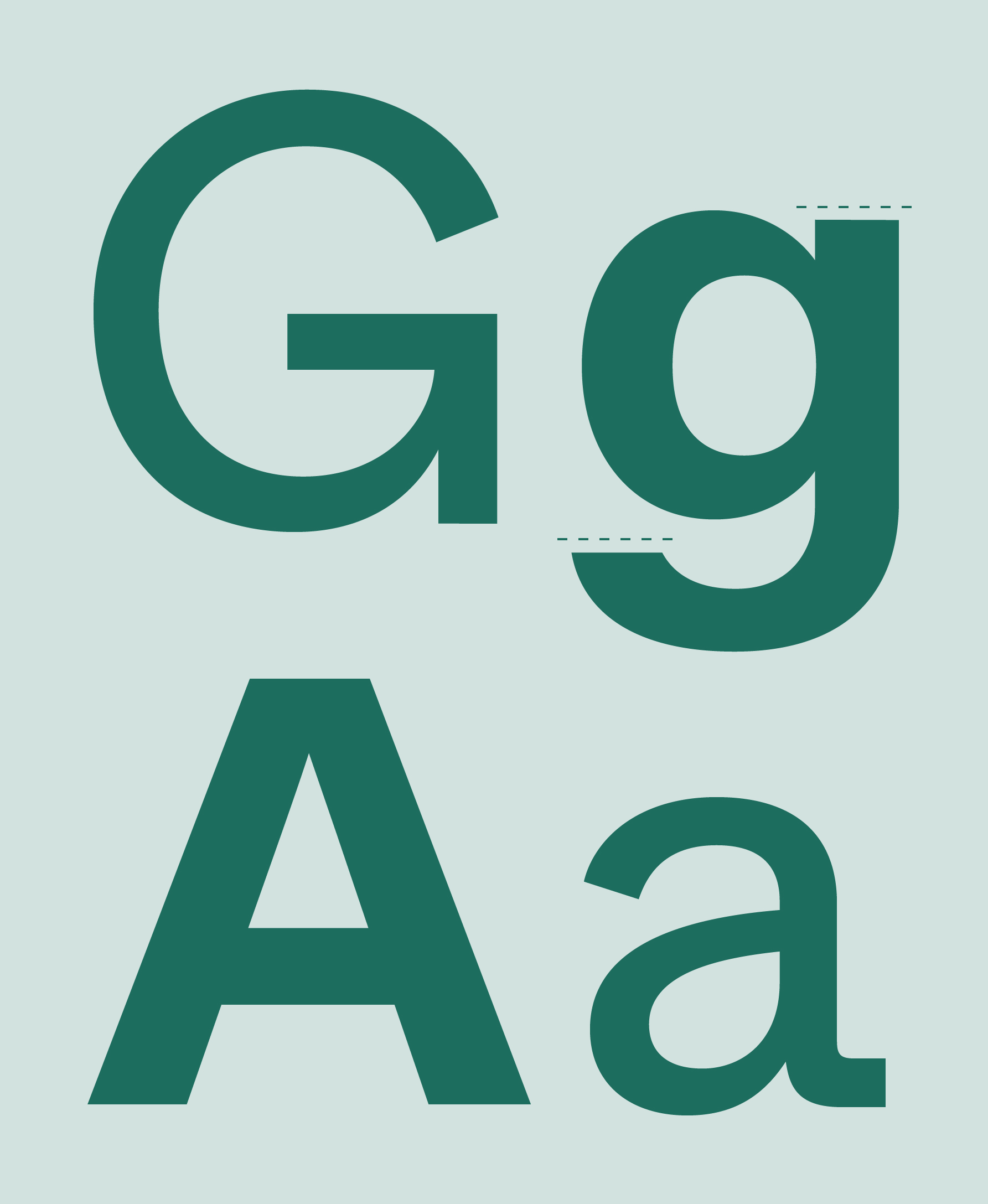
To convey IMATEQ‘s brand values as reliable yet adaptable and to maintain a consistent brand appearance across all media and channels, we developed a customized corporate font: VosslohRollingStock Whyte.

The typeface is characterized by having smooth and sharp transitions, its design has a strong horizontal approach. The typeface is a customized version of ABC Whyte, created by the type foundry Dinamo.
What is customized?
We customized the letters g, Cc and Ss to put even more emphasis on the linear and horizontal appearance of the brand.
Based on the logo design, the typeface is emphasizing the horizontal, stable and confident design from the logo, whether if it is used in the regular or bold cut. The fonts are available as otf, ttf, woff, and woff2.
Typographic Hierarchy
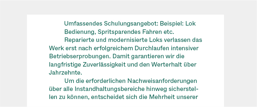
All text is set to left align, and never justified with no exception. Body text and subline uses indent on all sections except the first. More text about the hierarchy.
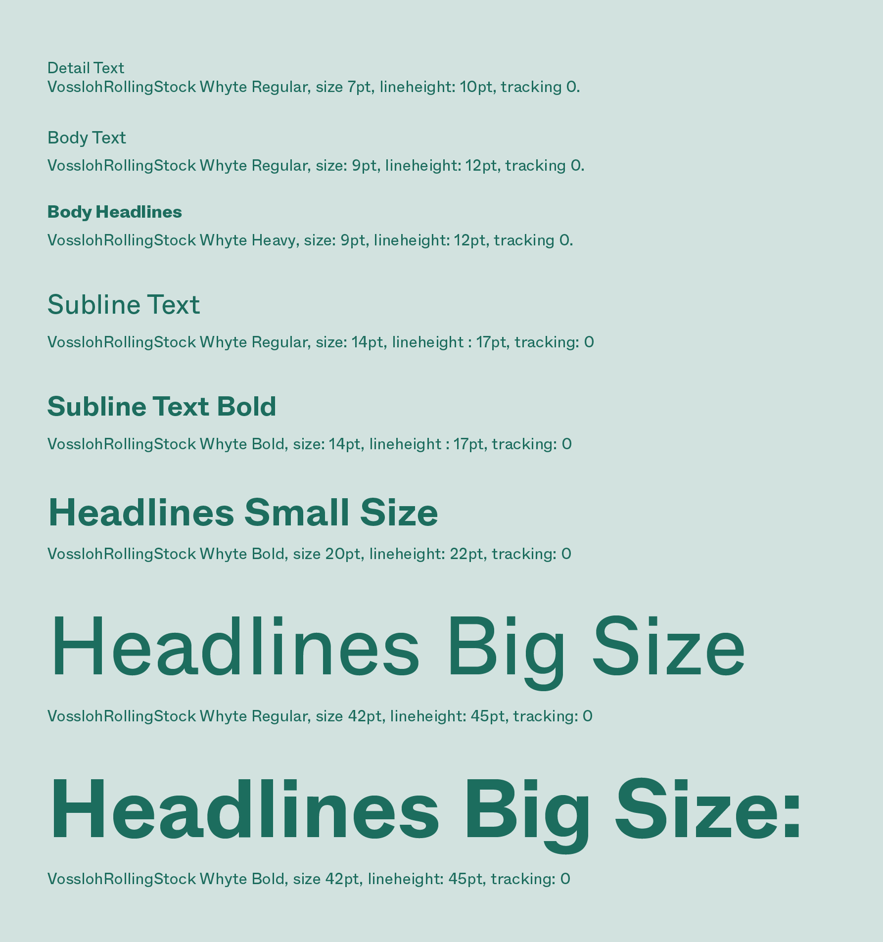
VosslohRollingStock Whyte / Fonts & Styles
IMATEQ uses two weights of the modern, yet timeless typeface VosslohRollingStock Whyte:
VosslohRollingStock Whyte Regular
VosslohRollingStock Whyte Bold
The typeface is a customised version of ABC Whyte created by the foundry Dinamo, emphasising the horizontal, dynamic and confident design from the logo. The typeface is based on the logo design creating a seamless connection to the logo, no matter if it is used in the regular or bold cut.
VosslohRollingStock Whyte Regular
Is used for part of headlines, quotes, body copy and detail text. Bodycopy and detail text is always set in black or Pine. Headlines and quotes are set in
IMATEQ Pine, White, or a tint of Pine.
VosslohRollingStock Whyte Bold
Is used for boldening/emphasising of text.
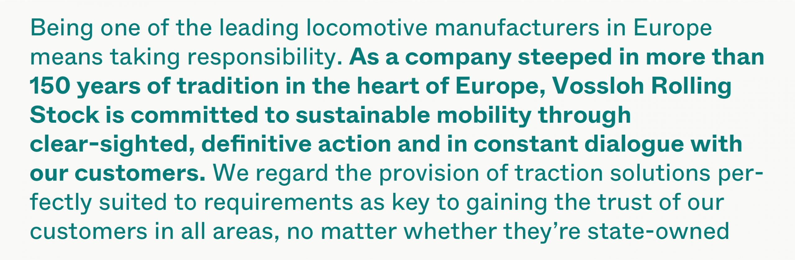
All text is set to left align, and never justified with no exception.
Body text and subline uses indent on all sections except the first.
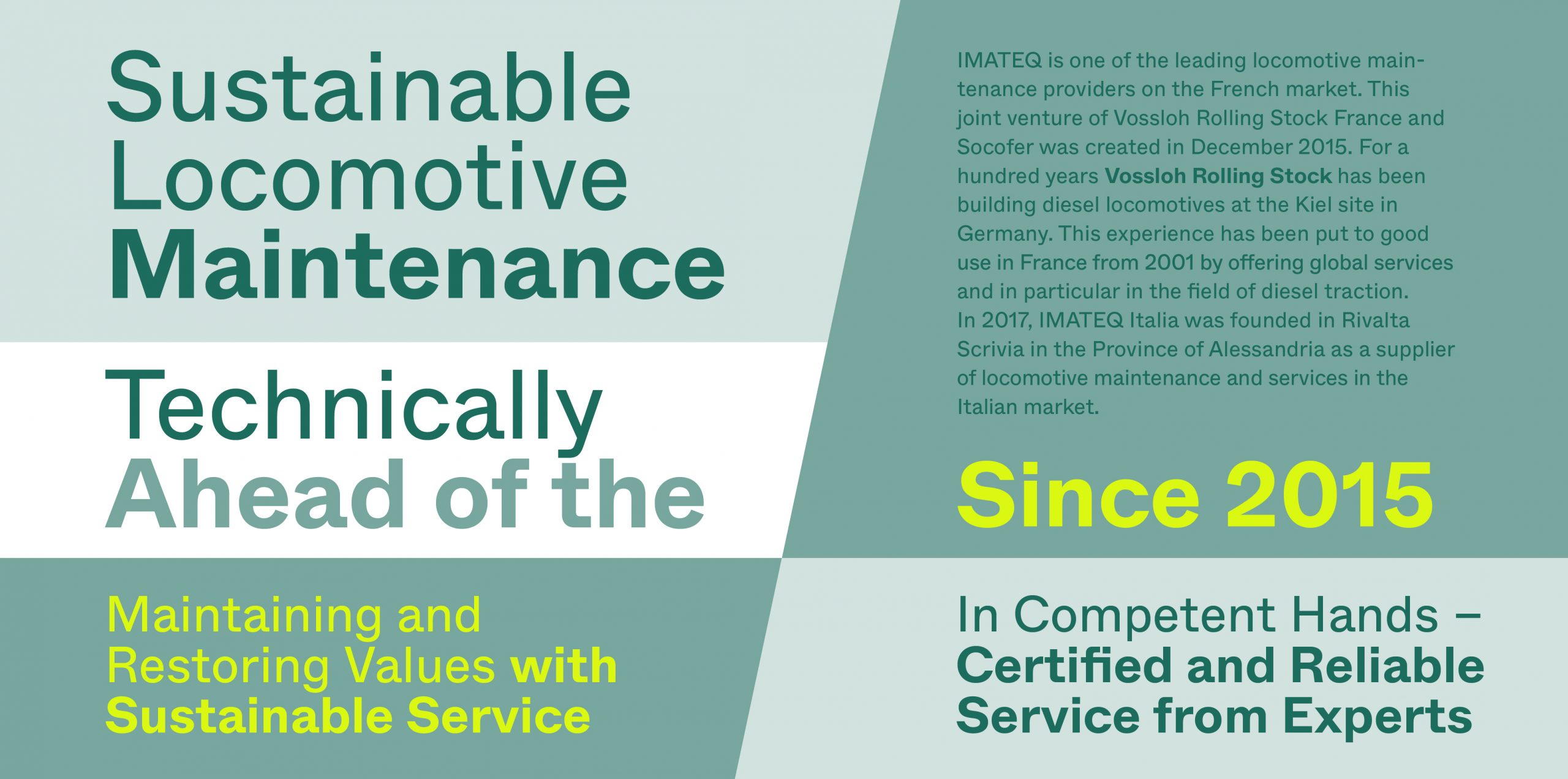
Headlines
Headlines are always set in the regular and/or bold font cut, left aligned and, in English, with Sentence case.
If headlines get longer, they can be set in two weights to appear less heavy and have some contrast. When headlines with mixed weights are used, it’s always mixing VosslohRollingStock Whyte Regular (in the first line) and VosslohRollingStock Whyte Bold (in the second line).
Headlines with two different weights can have three kinds of layout set ups:
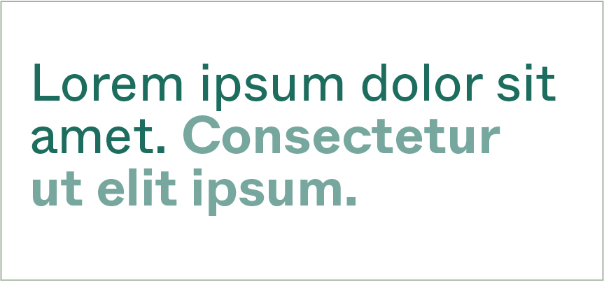
Opt. 1: Mixed
One where the the first half is in Regular weight and the other half in Bold. In Pine on white or light 20% tint of Pine.
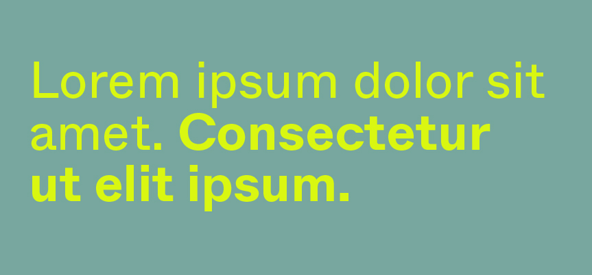
Opt. 2: Mixed
One where the the first half is in Regular weight and the other half in Bold. In Future Yellow on 60% tint of Pine.
Opt. 3: Mixed
When on white background, the first half in Regular and Pine, and the other half in Bold and 60% tint of Pine
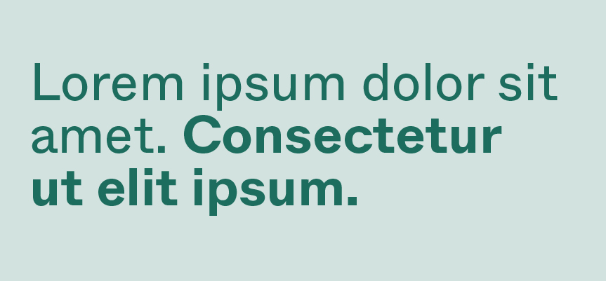
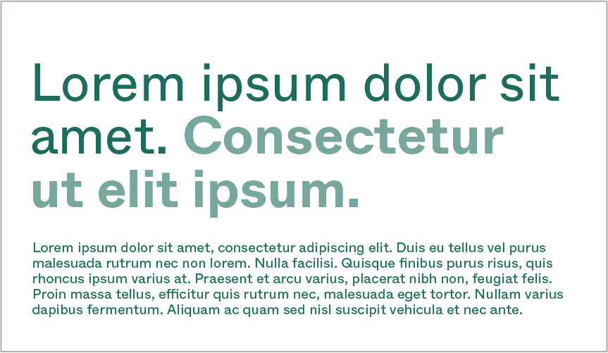
This is an example of the headline Opt. 2, combined with body copy — showcasing the contrast in font sizes.
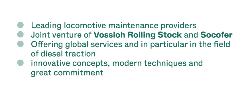
Bullets
Bullets are always made as solid/filled circles in 40% tint of Pine.