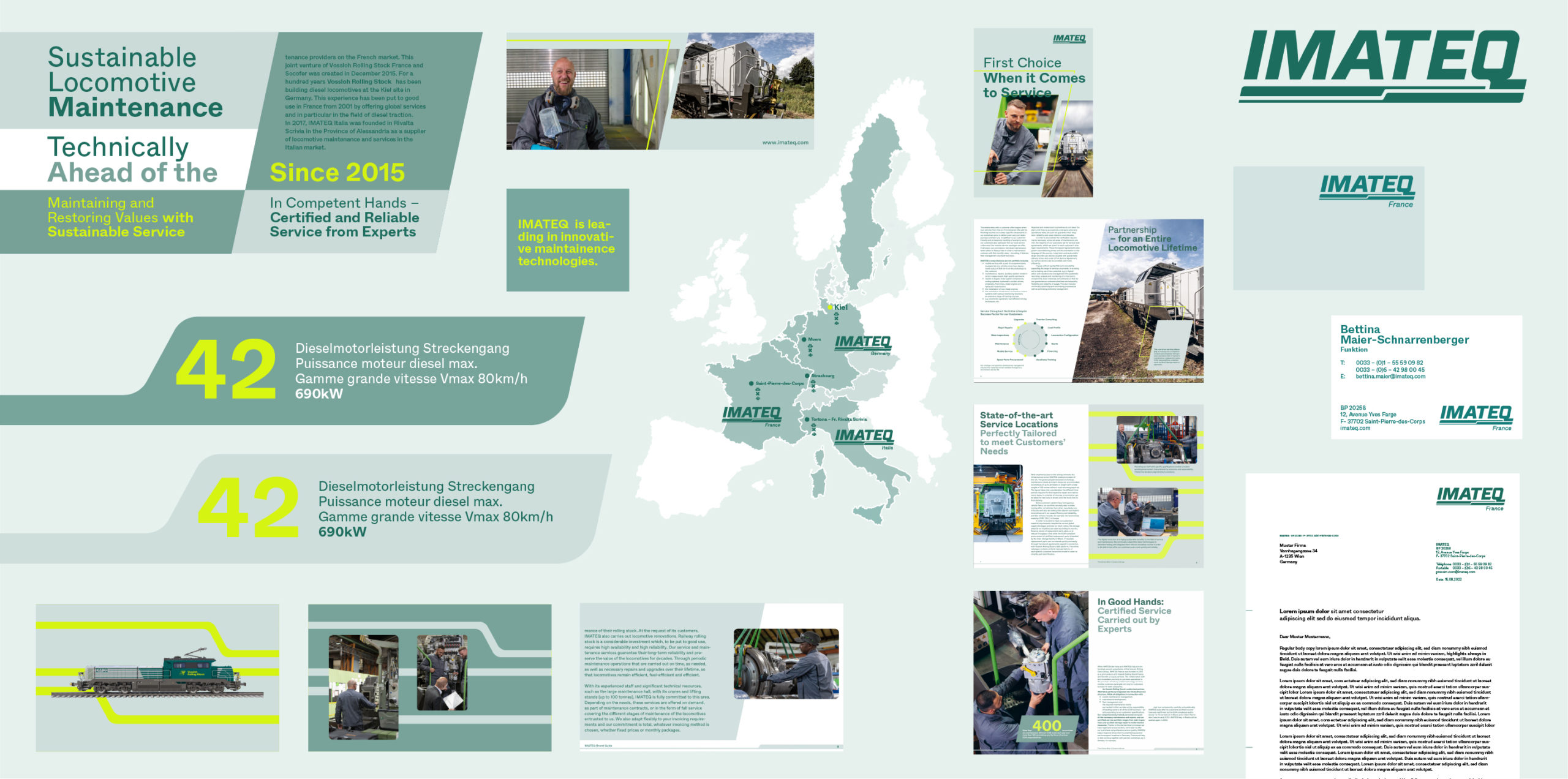
Our graphic world expands on our dynamic aesthetic and represents a modern and evolving IMATEQ. Balancing the appearance of traditional engineering and our strong drive towards a highly sustainable future, the graphic elements are engineered yet natural and evoke a technical yet friendly look. All elements should have a clear purpose, support content and guide a user to understand our products and services.
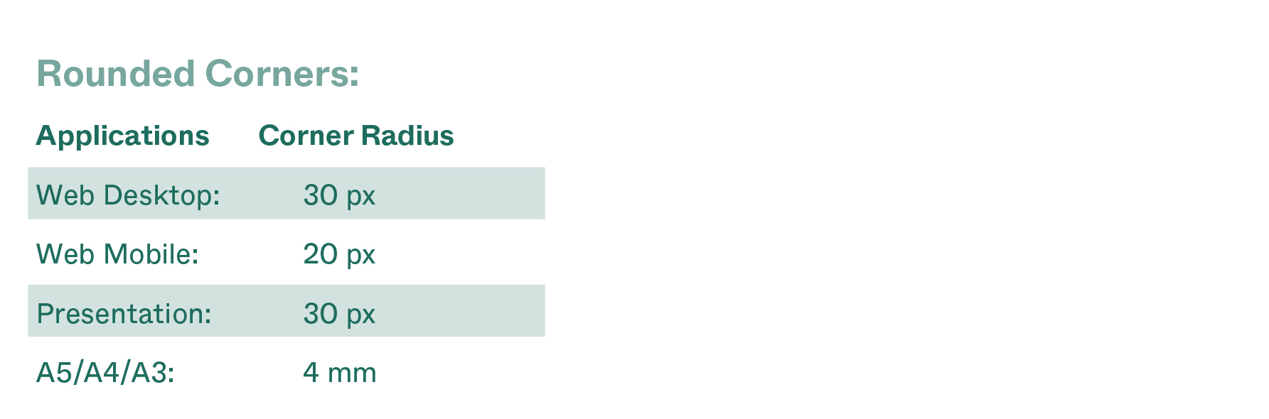
Rounded Corners
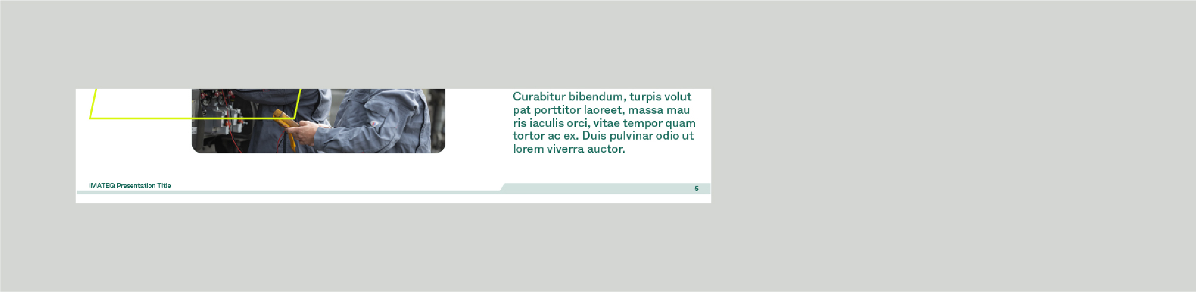
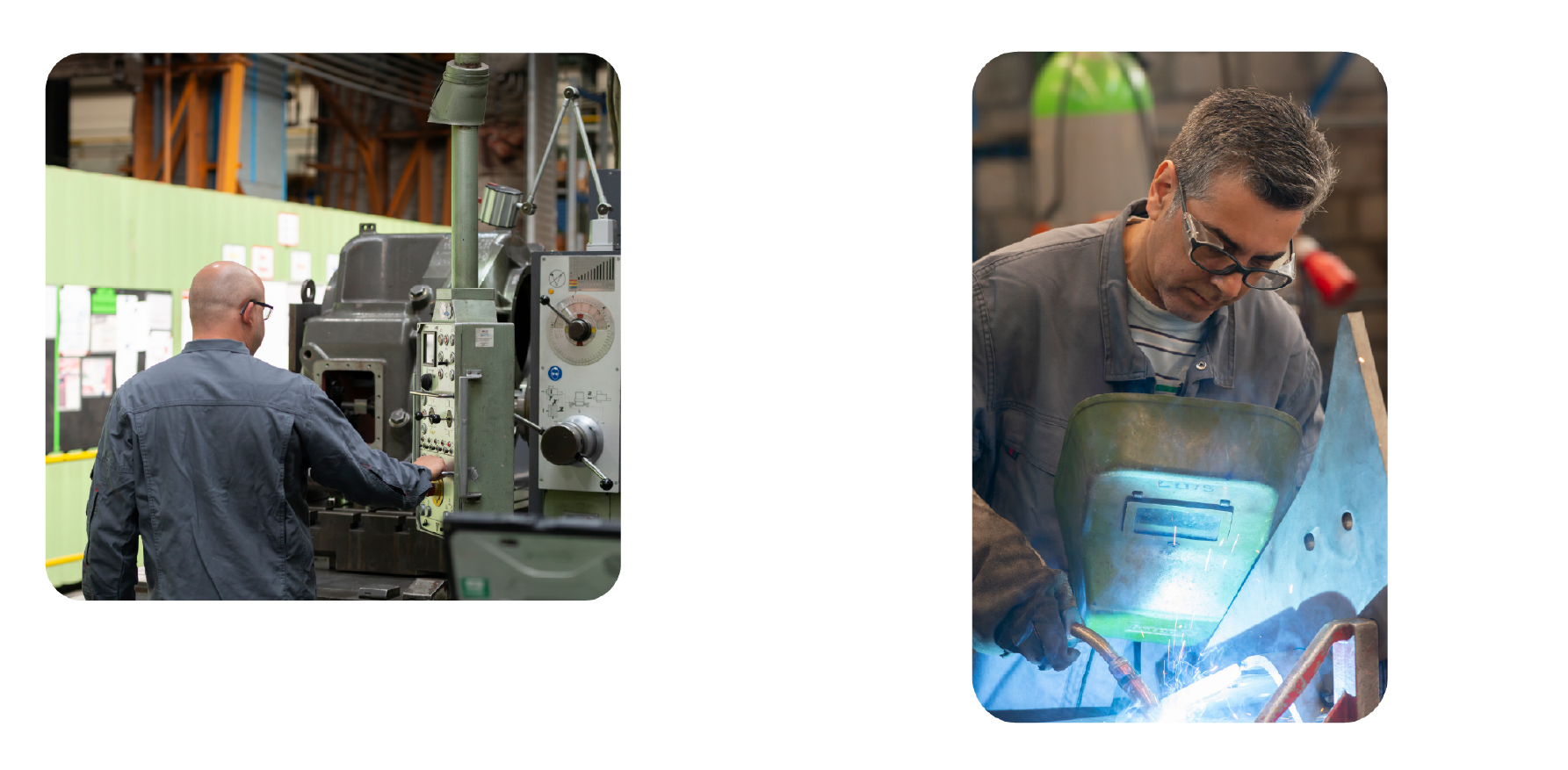
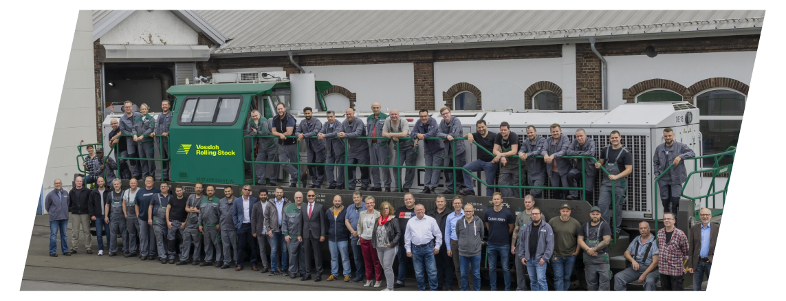
To give the visual identity a modern look and to compliment the figurative mark, the design features rounded corners on smaller images and highlight boxes. They should be applied according to the following size rules, to make sure the corners don't become too big and prominent within the layout.
On Images.
If an image is not covering the full height of the format, the image should be placed with a distance to the border and feature rounded corners.
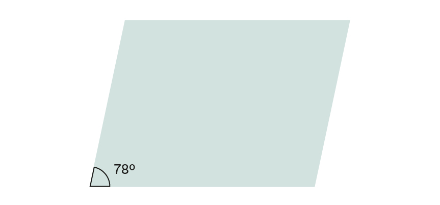
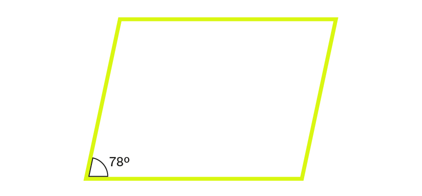
Angled Rectangle
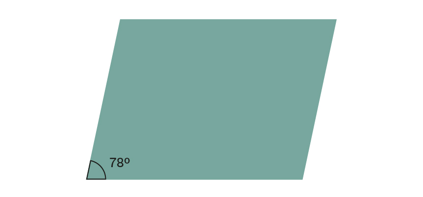
Taking from the italic angle at 78º in the IMATEQ logo, we took it forward as a graphic element and use the box sheared/tilted to 12º — a feature present in Adobe softwares.
Some features of the box are as follows:
— It can be used to carry images
— It can be used as a text box
— It can be used only as an outline using Future Yellow and used as a highlight/complimentary to the other content on the layout
— It can be scaled up and down and horizontally and vertically. It remains flexible depending on the use and layout
Footer Shape
The IMATEQ logo with its 3 components (the italic wordmark, the intersecting Q and the moving lines at the bottom) lends a range of design elements that help us take the identity and visual language forward.
The line shapes at the bottom work very well independently as a footer, as a background and as a distinct IMATEQ feature. As a footer, it can be used in the following ways -
— Text is allowed inside the right part, the left thin part can have a page number or title on top of it. This can also be revered (see image brochure example on the right)
— It can be horizontally increased in size. Be mindful of not distorting the angles and proportions of the shape
— It cannot be flipped to the left (see image at the bottom)
Presentation template
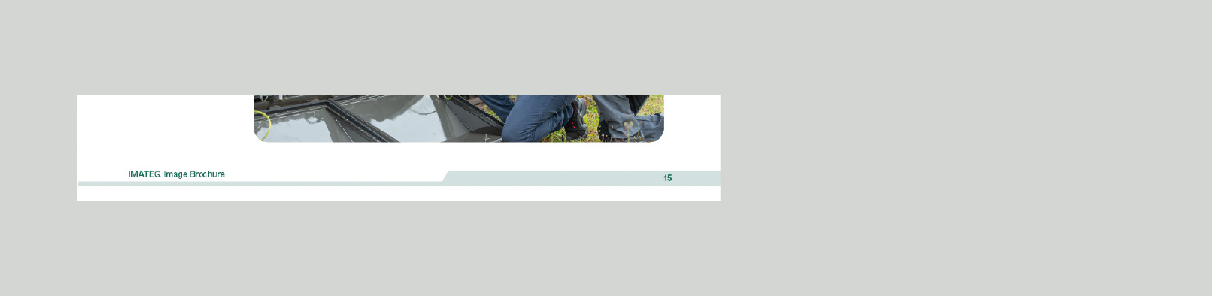
Image brochure
Letterhead
The shape should not be flipped to the left
Shape Pattern


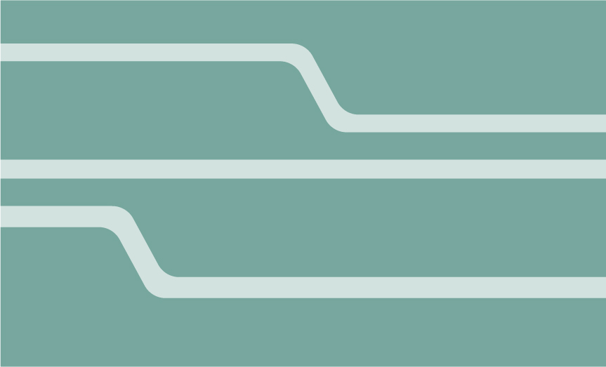
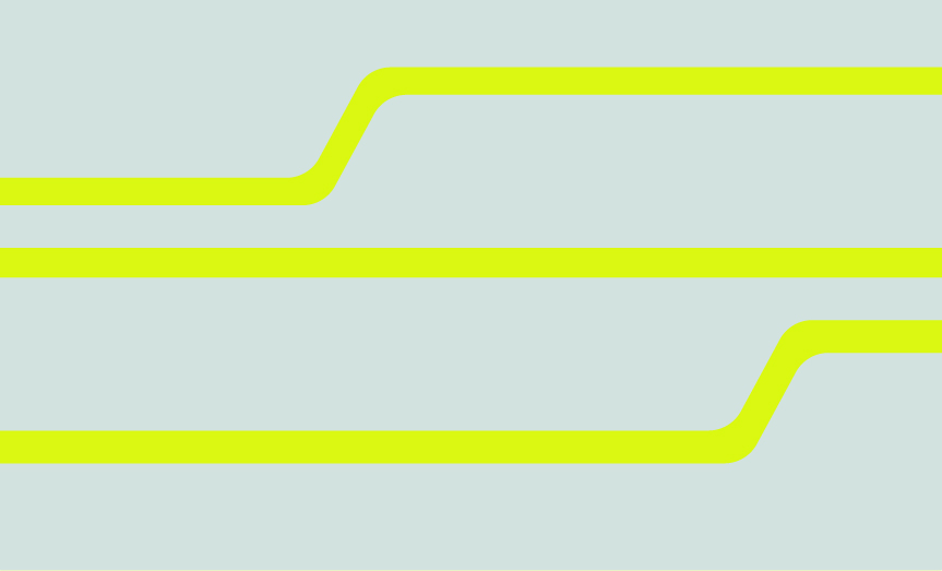
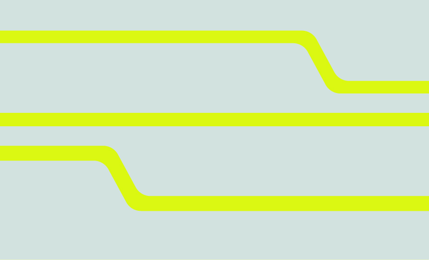
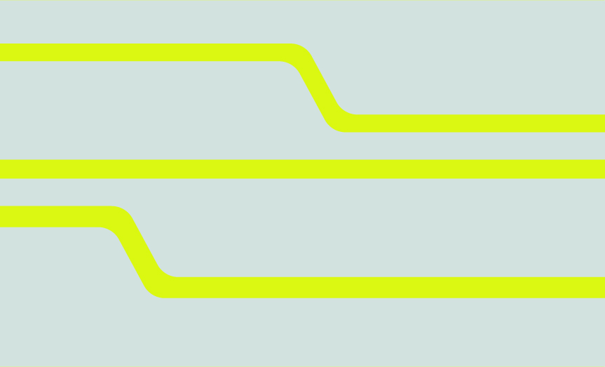
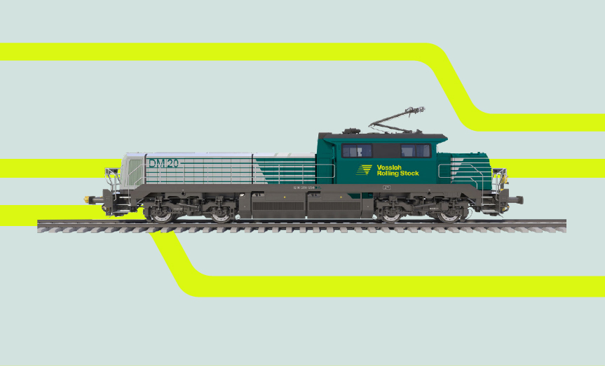
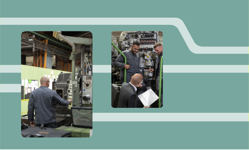
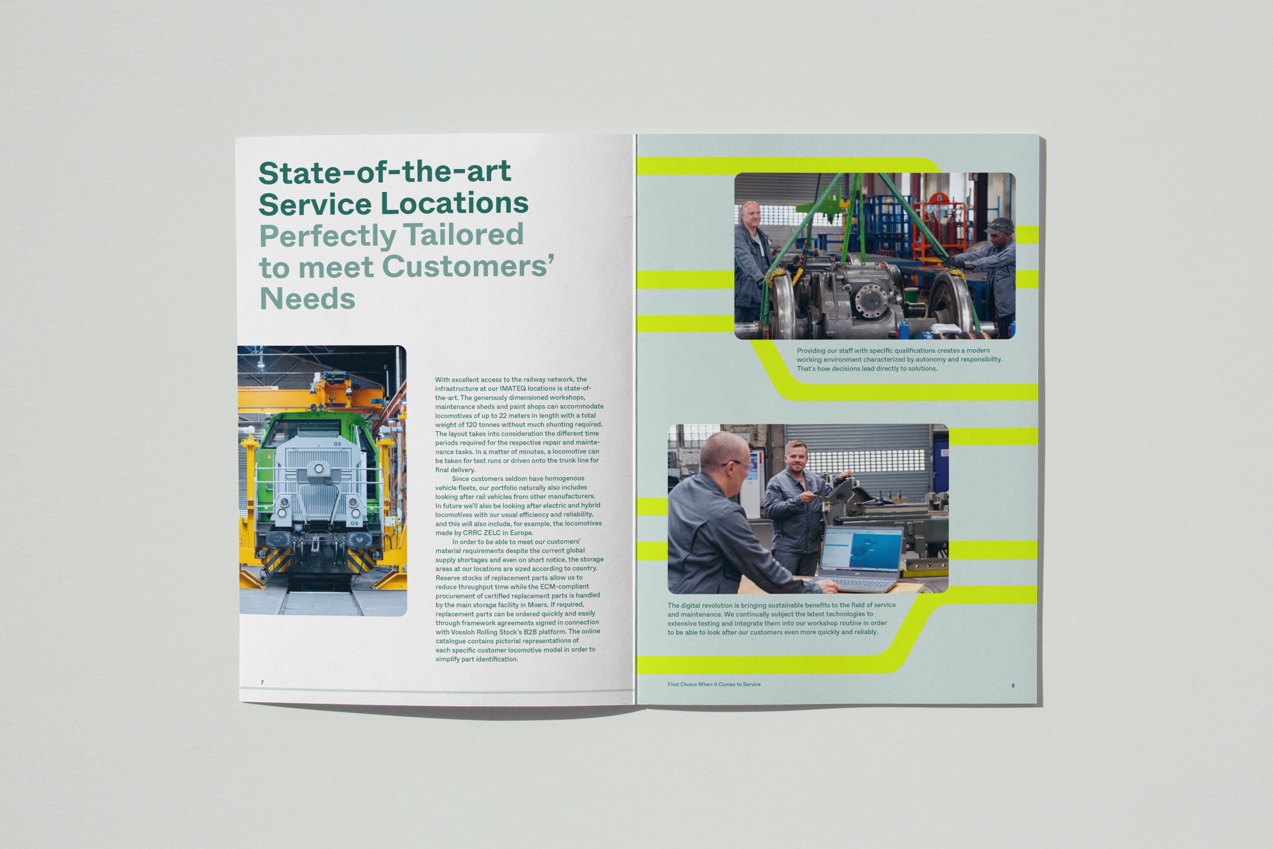
Image Treatment
IMATEQ presents its images in two ways, taking from the rounded elements in the logo's figurative mark/line shapes, and the angled rectangle we use for text boxes as well.
The shear angle is 12º.
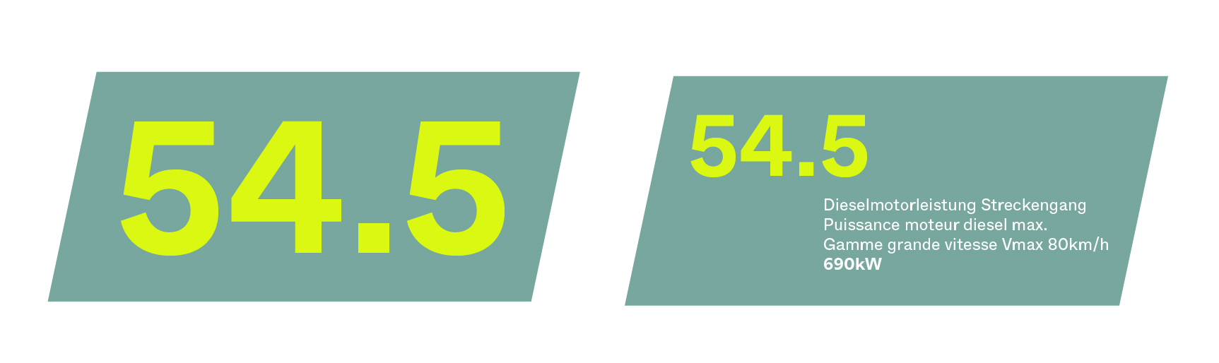
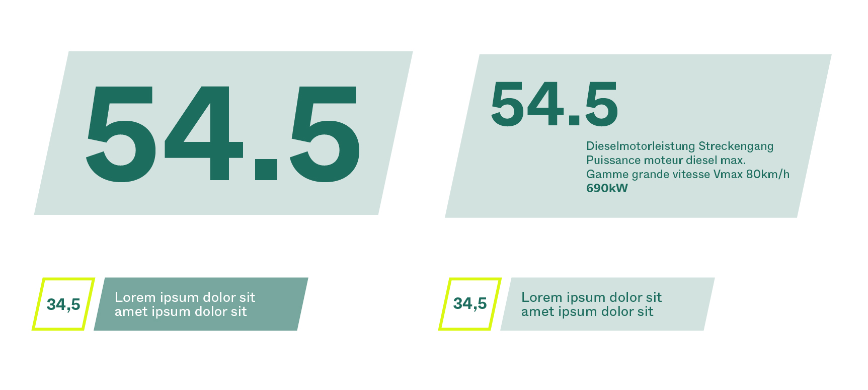
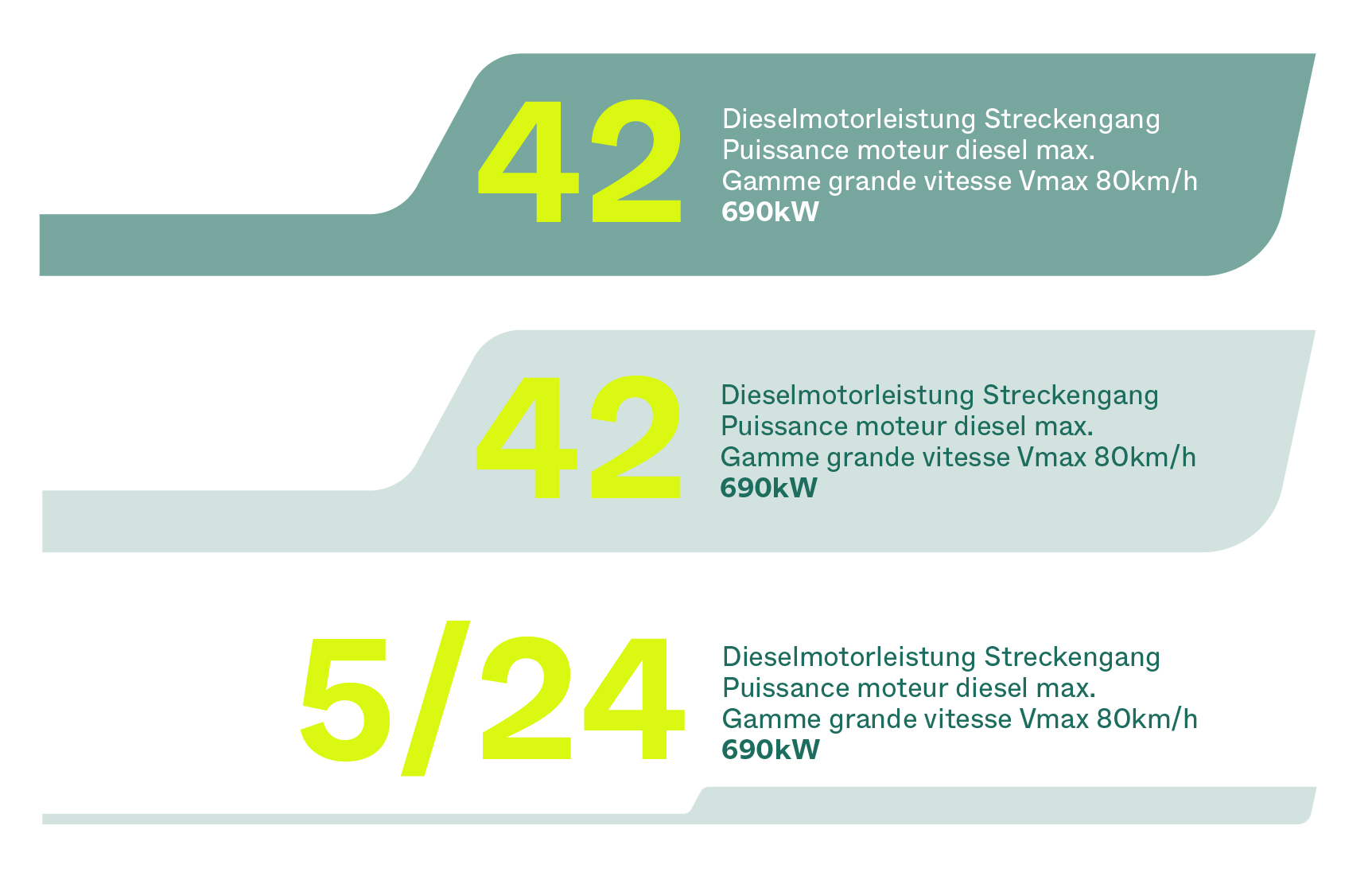
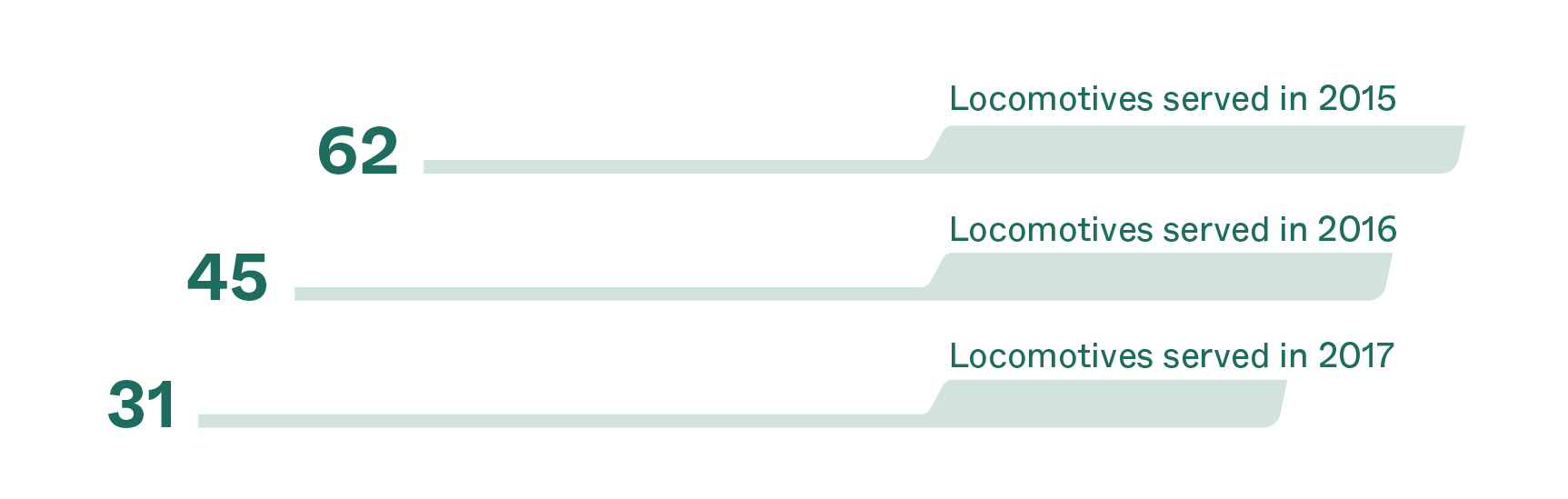
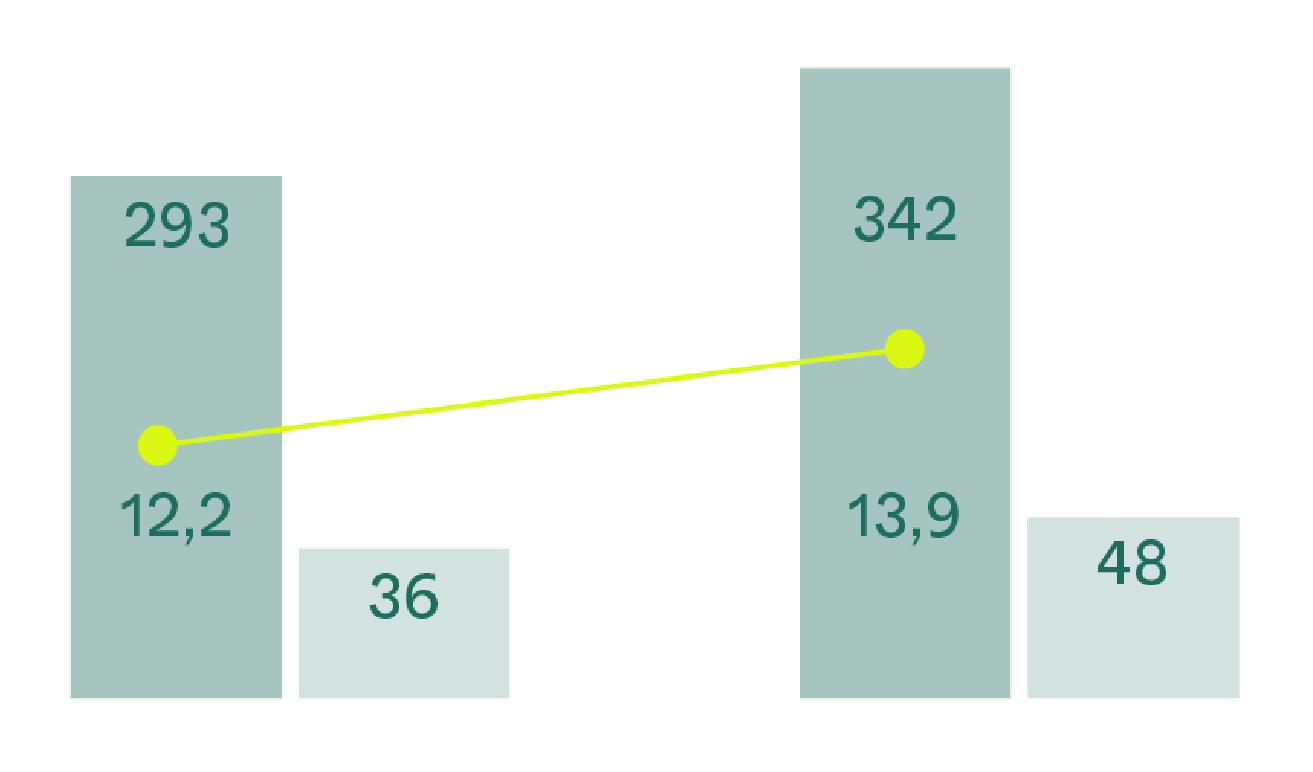
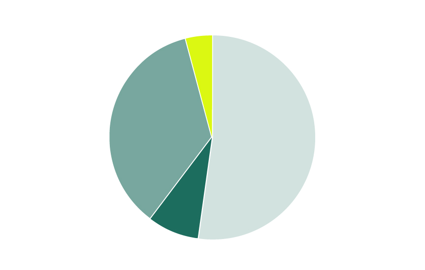
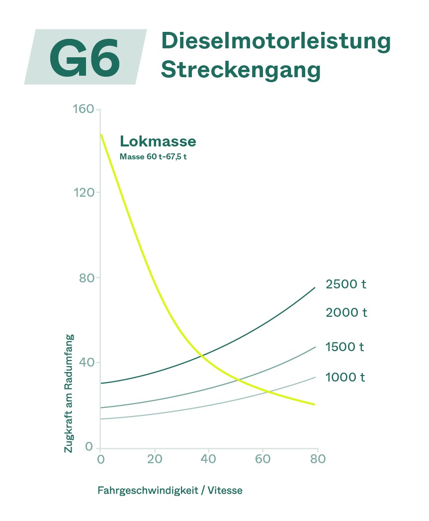
Infographics
When using charts and diagrams, headlines, tags and short infos are always set in Pine.
Future Yellow is always used to set a highlight, or sparingly as text when there is a Pine background.
Primarily, the tints of green are used to represent pies and charts and diagrams with IMATEQ.
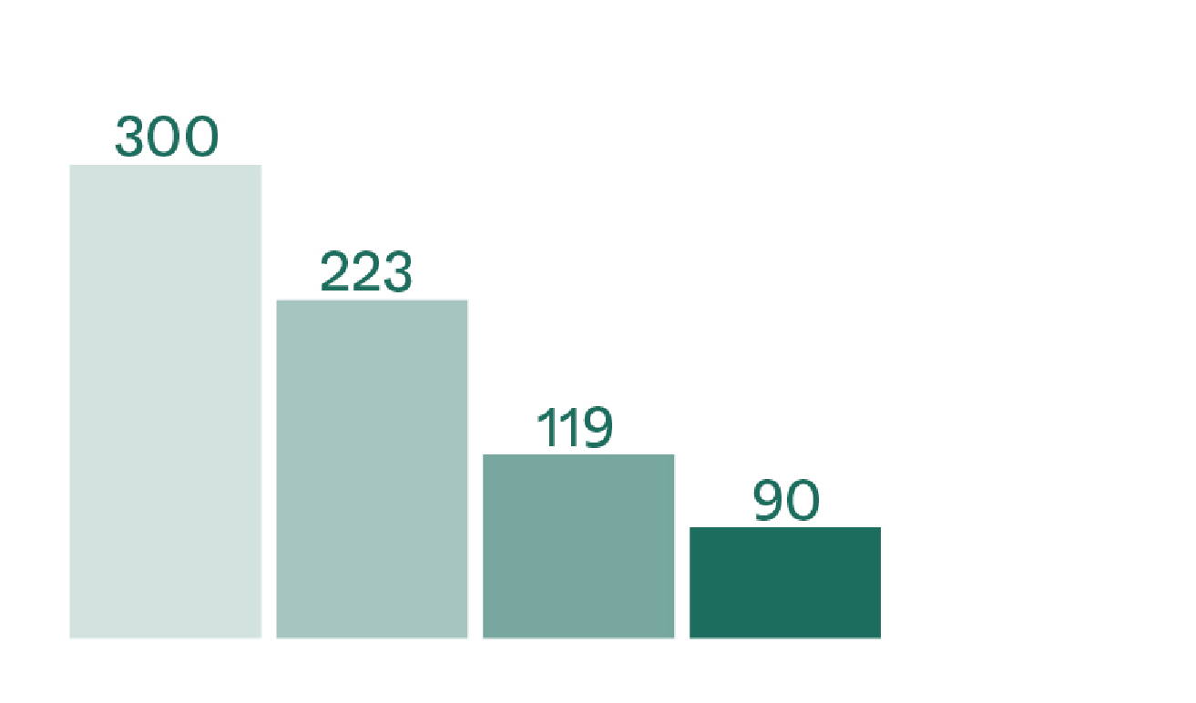
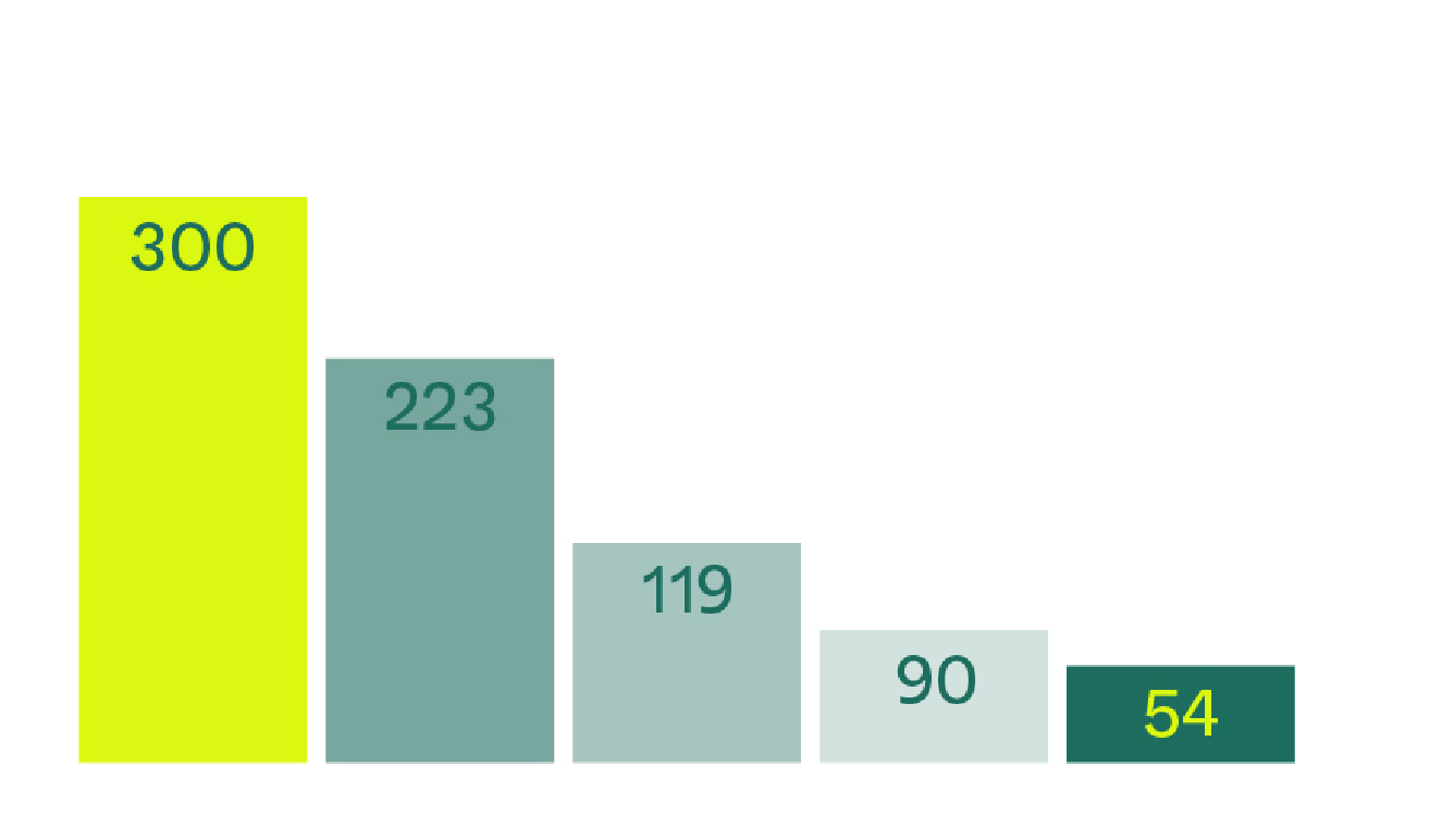
Statistical Infographics
The statistics can be written in a few stylistic ways-
— Using the sheared/tilted box
— Inside the bat/line shape that is scaled up to fit text into it
— The line shape can also be scaled horizontally to visually represent some statistics