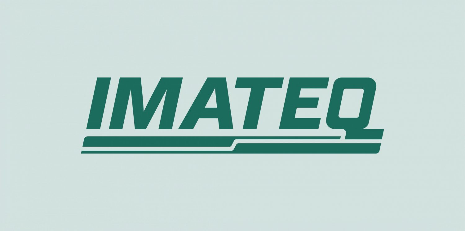
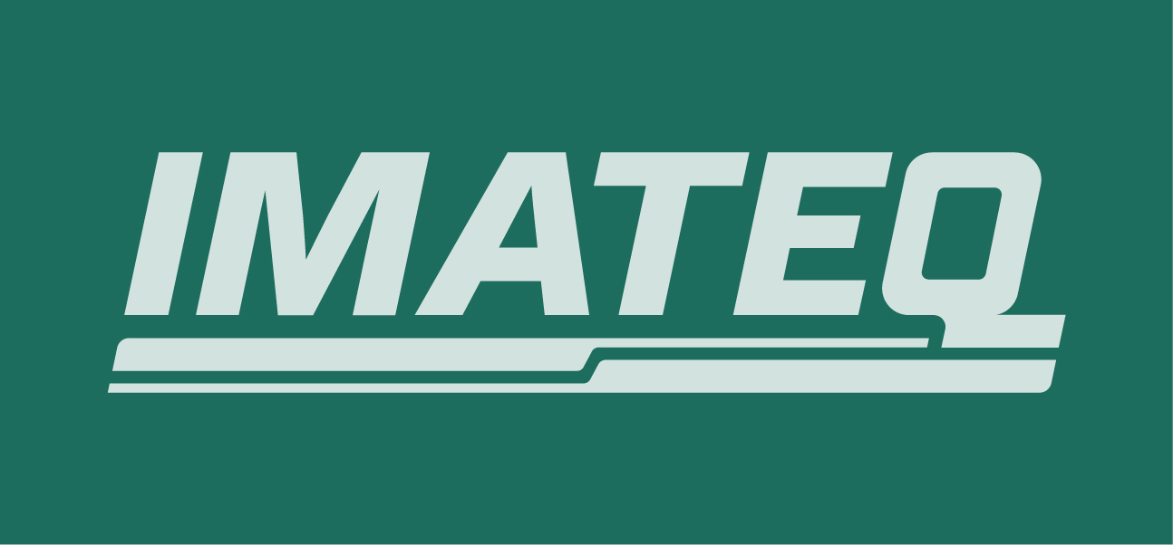
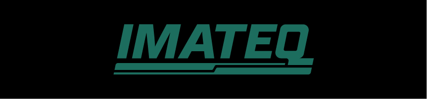
The IMATEQ logo was created by combining the most iconic and recognisable visual qualities of the old IMATEQ logo and the existing logo of the French joint venture partner Socofer.
The logo celebrates the qualities, both tangible and intangible, of a rich history of the two brands that have worked together for years in ensuring a very important service in the world of locomotives.
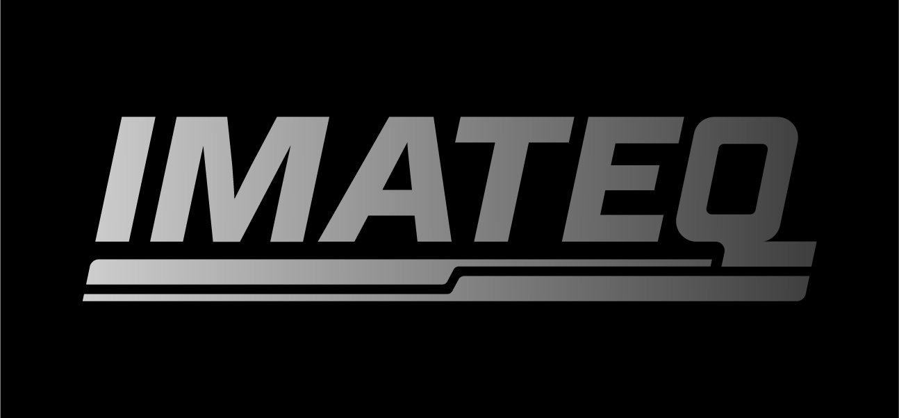
The IMATEQ logo comprises a few elements including:
— The wordmark in Italics using a bold and powerful type style, making it distinct and unmissable on every format used
— The custom intersecting “Q” of the wordmark IMATEQ that is part of the type but also interacts with the shape below, representing fluidity and improvisation
— The double lines mirrored to each other form the shapes that can be also used independently IMATEQ’s visual branding and art direction
The angle of the tilt is at 78º.
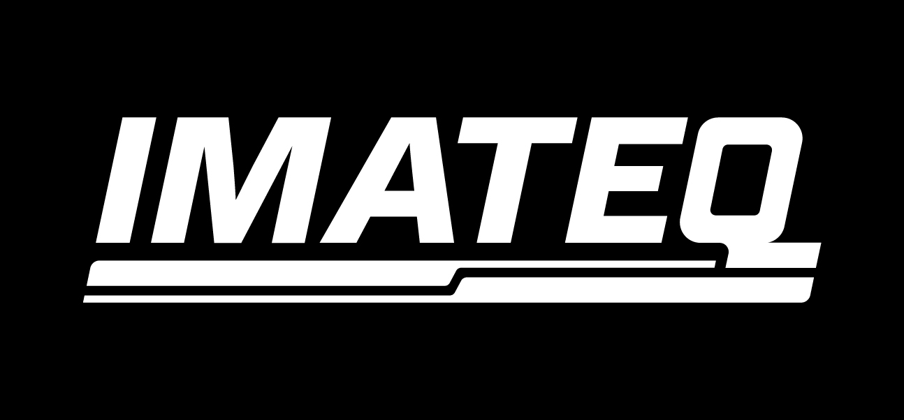
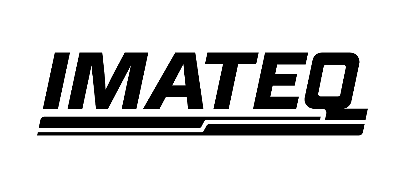
All the elements of the logo (wordmark + line shape) are always displayed in the same colour together, which is IMATEQ Pine, or in some cases — in Black or White.
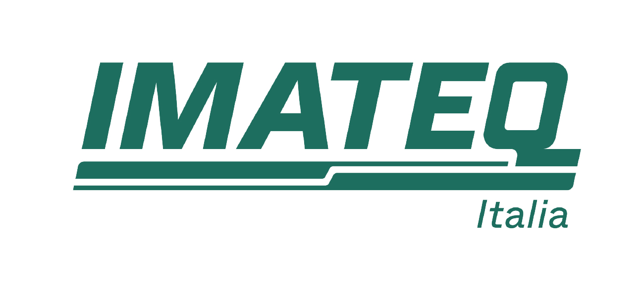
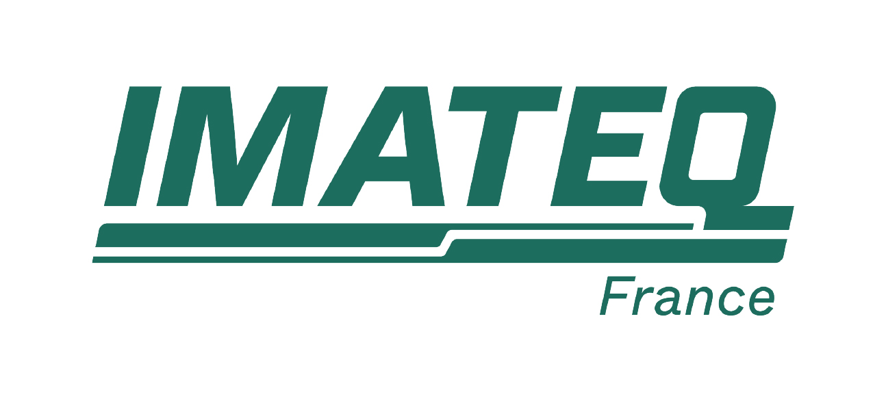
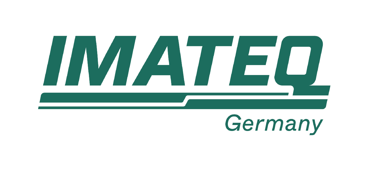
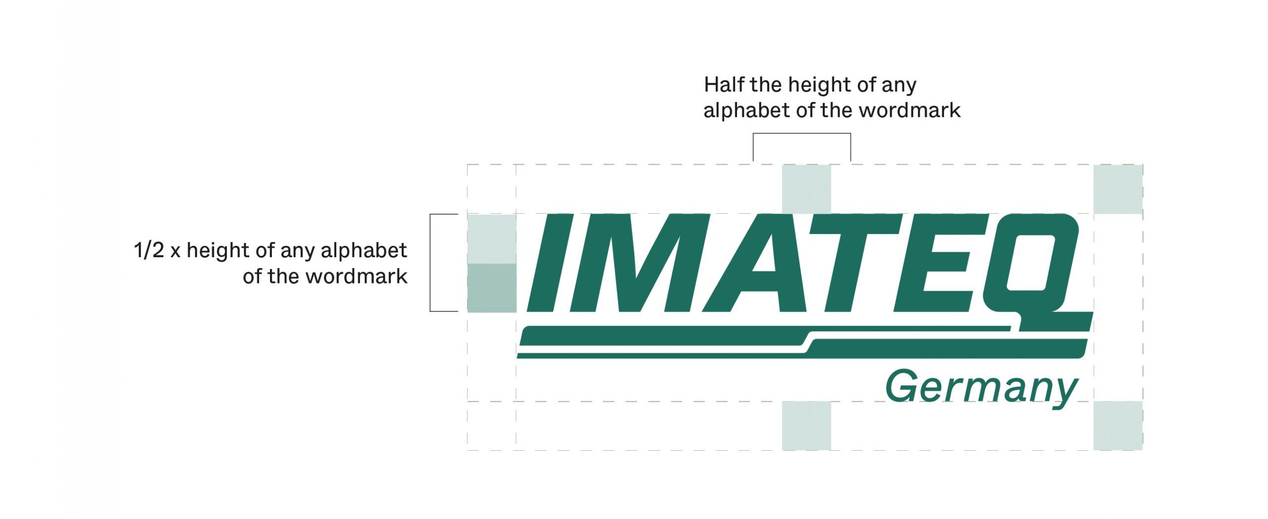
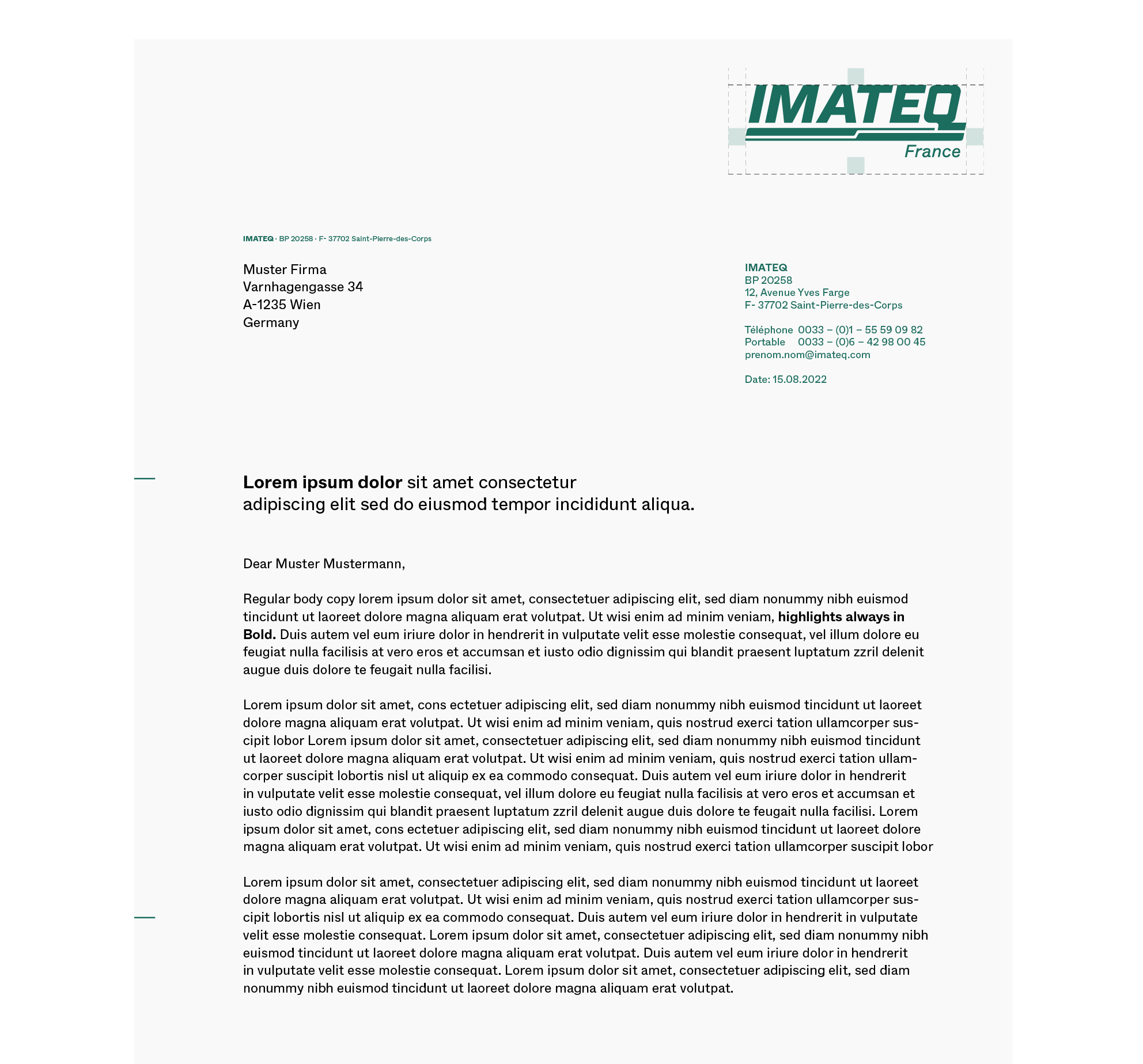
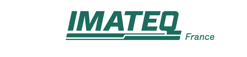
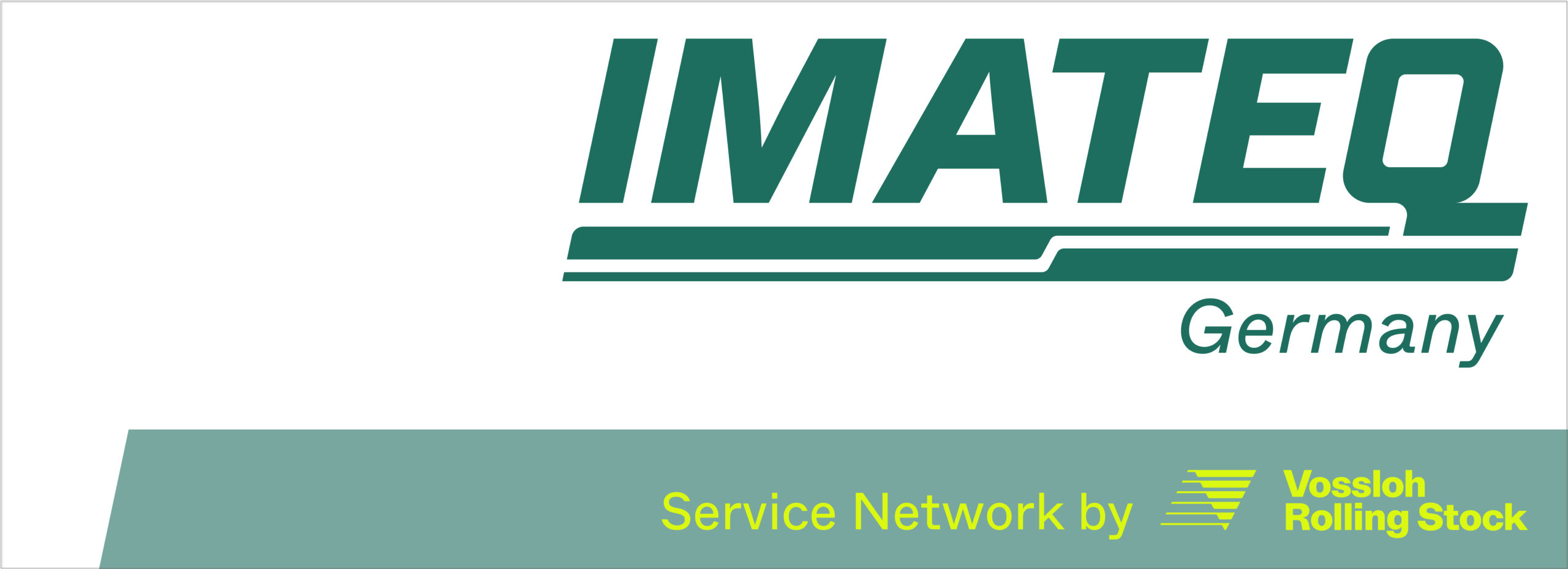
IMATEQ operates in three counties; Germany, France and Italy. The sublogos are created to have a distinction and visual clarity to categorise the logo based on its geographical positioning.
Color Use and Placement Rules
Logo on Images
(All rules apply to the sublogos).
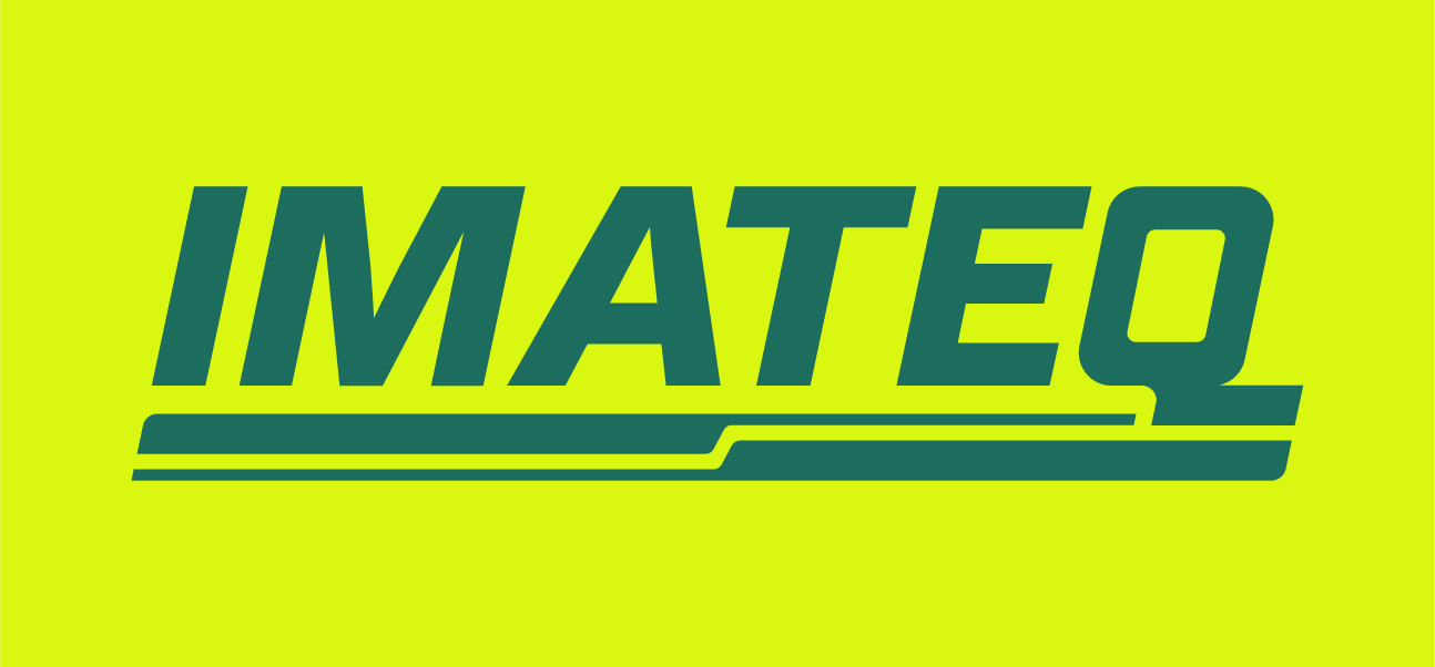
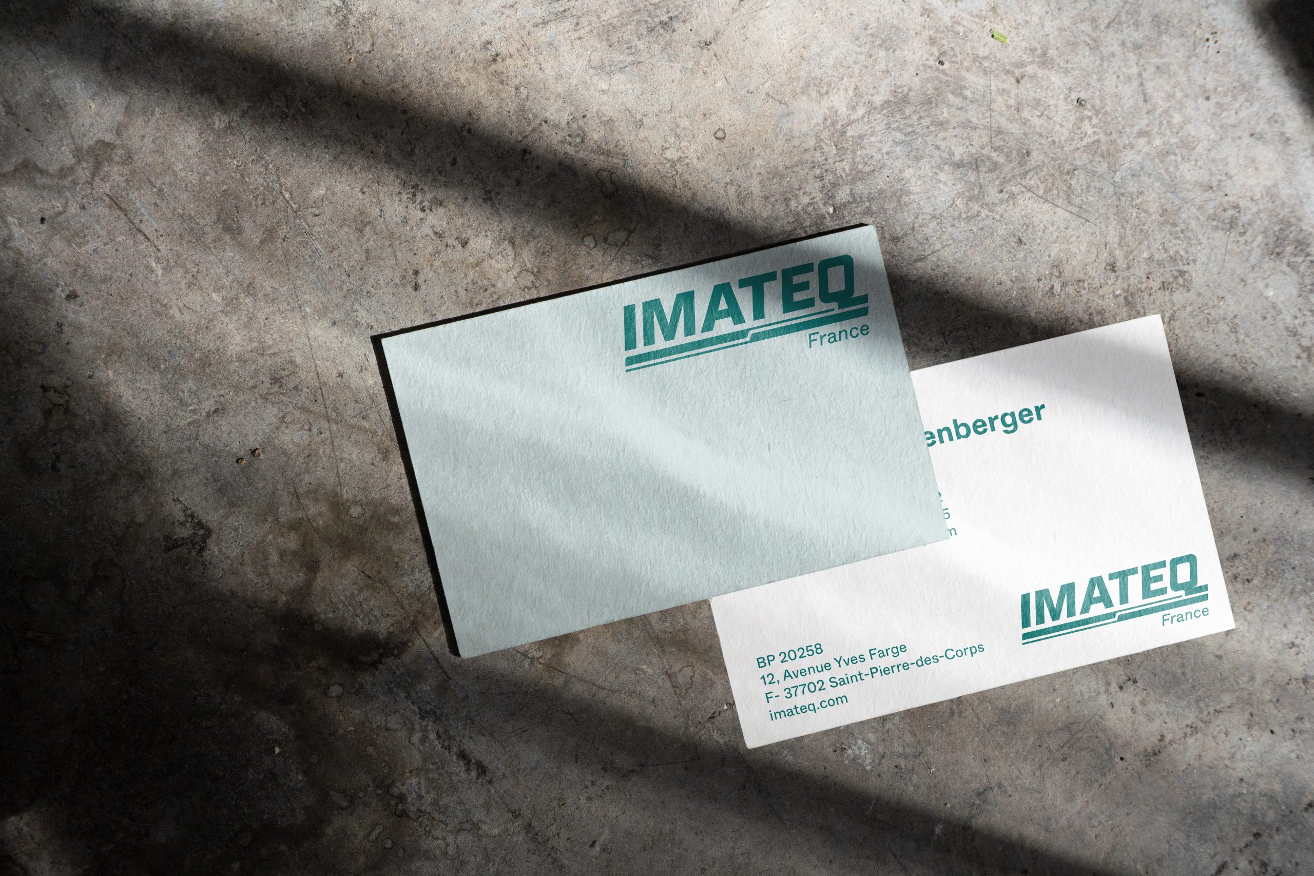
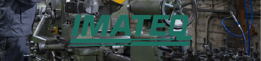
The IMATEQ logo must always be in the IMATEQ Pine colour, or black and white (if coloured is not an option). The logo should always be placed on the right side of the layout of all forms of communication — digital or print. It is free to move and can be on the top or bottom right.
Backgrounds for 100% Pine Imateq logo:
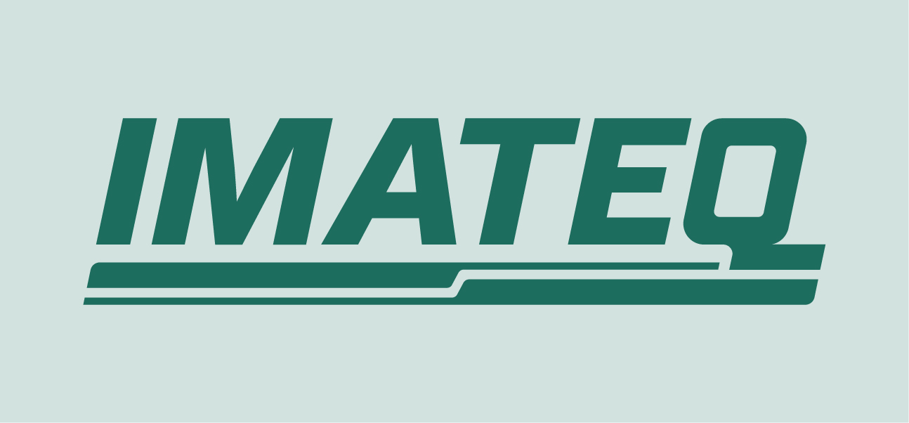
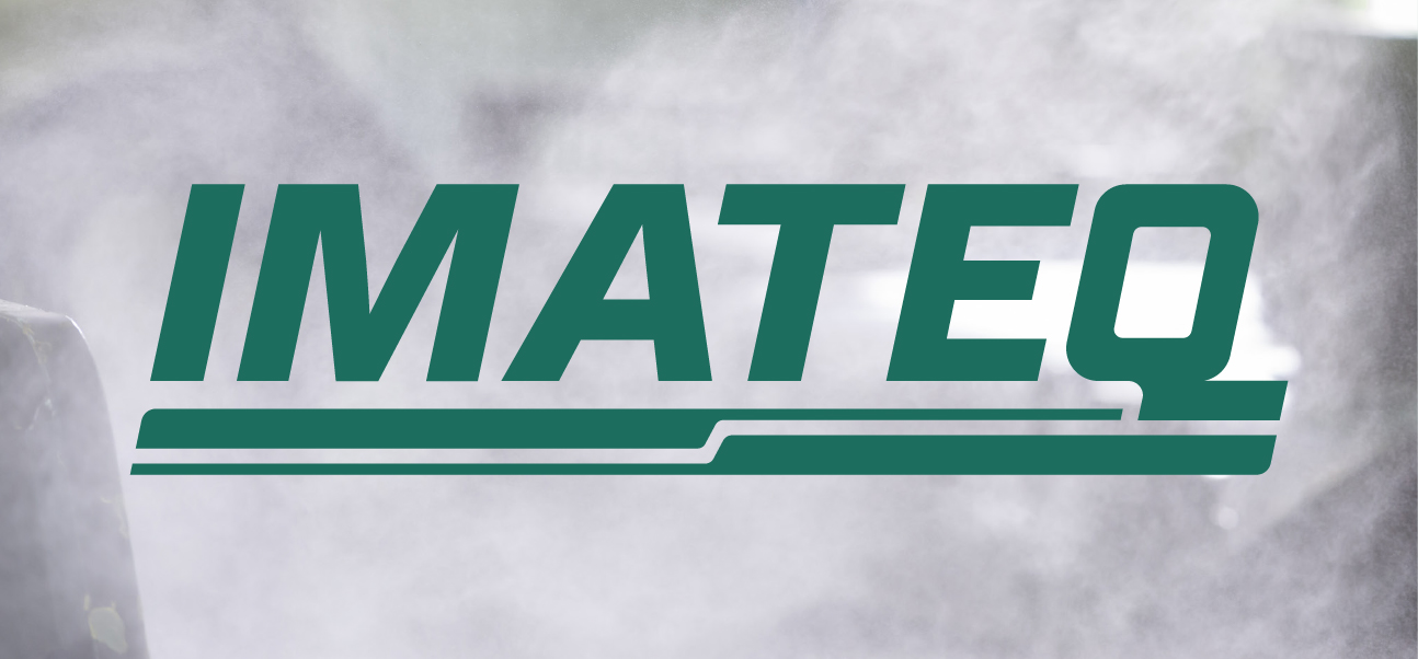
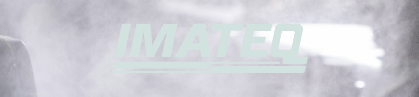
The logo can be used on the 20% tint of IMATEQ Pine colour, on white, or on a light image background, where the logo remains clearly visible.
In some cases, white IMATEQ logo can be used with these backgrounds:
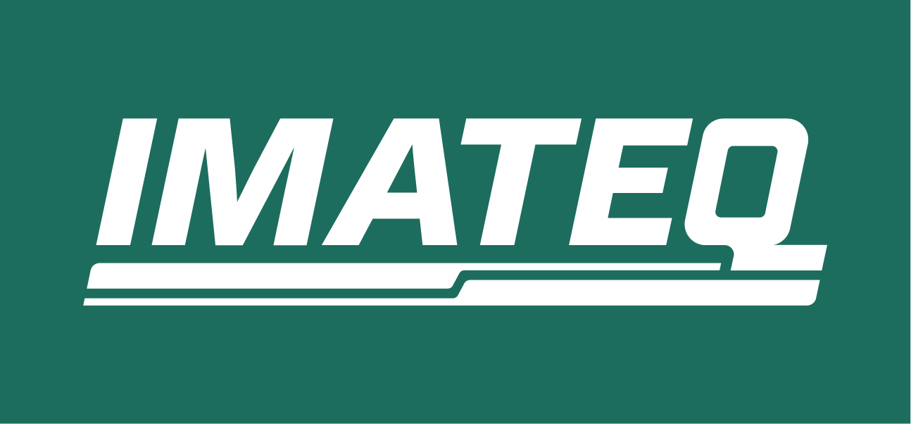
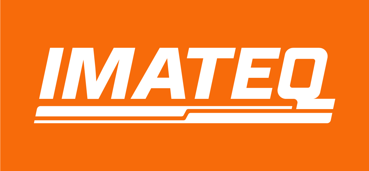
The white IMATEQ logo can be used on a Pine background, or on an image background that is darker.
An inverted logo option with 20% Pine logo on 100% Pine can be used as well.
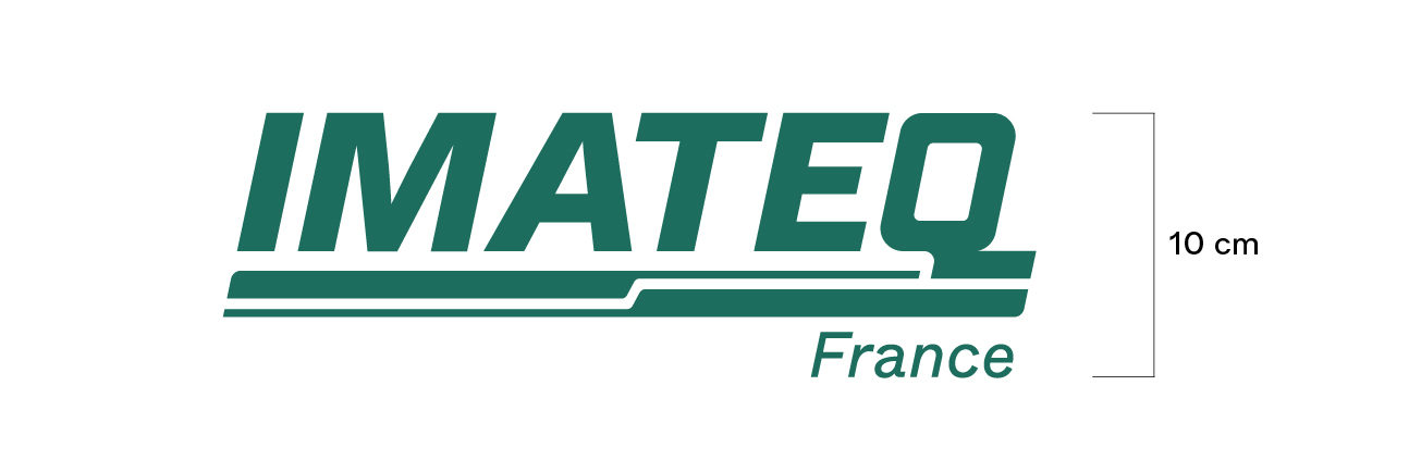
The sublogos with country names are always used as a unit and the country name remains fixed in one place.
Applications in Black and White
Applications on Safety Clothing
These are the proposed combinations of colours that work as safety colours for IMATEQ in clothing, and potentially other formats too.
Standard display: White logo on Reflective Silver.
On Neon Yellow the logo should always be used in Pine.
Standard display: White logo on Neon Orange.
Reflective silver on Neon Orange.
Standard display: Pine 20% on Neon Orange.
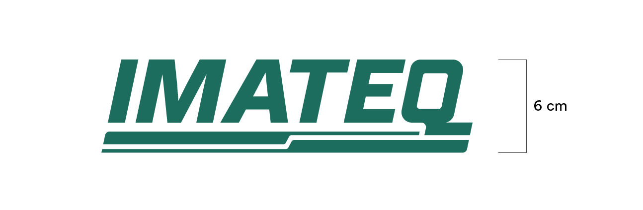
Minimum Size
IMATEQ logo's minimum acceptable height is 6 mm, preferably a bit bigger.
IMATEQ's sublogos' (with country) minimum acceptable height is 10 mm, preferably a bit bigger.
If the logo needs to be printed smaller: The sign plus the URL is used. For embossment the logo minimum height is 10 mm.
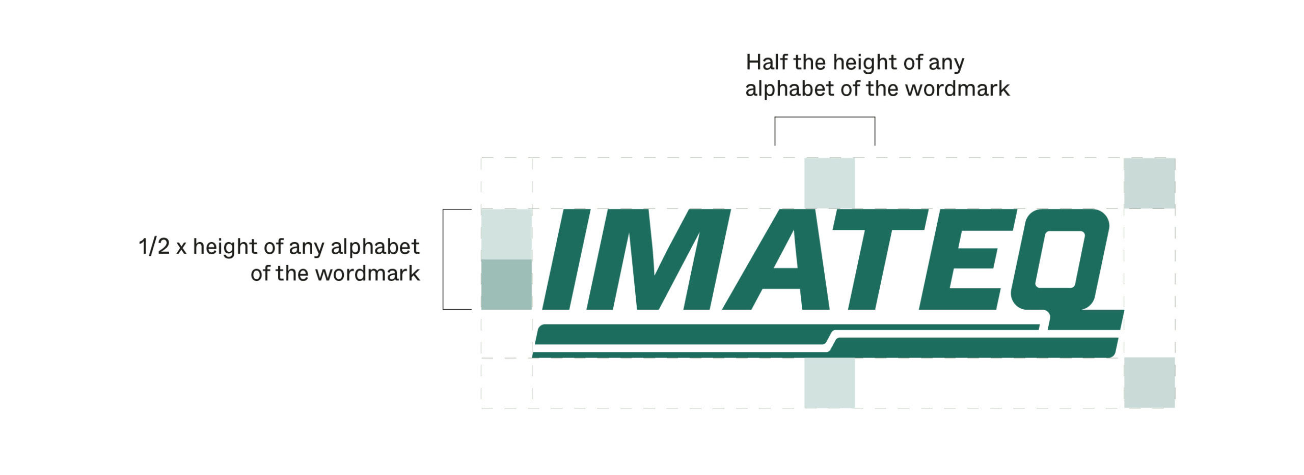
Safe Space
The safe area around IMATEQ's logo would be half the height of any of the alphabets of IMATEQ.
More space can be added if needed, but this is the proposed minimum space around before adding any other text/image/element around the logo.
Logo Placement Rules
The logo can be placed in two ways:
Top right corner (e.g. letterhead, print ad or brochure cover) or, more rarely, bottom right corner, minding the safe space.
The logo will never be placed at the center of a layout or on the left side. It is free to move vertically and can be on the top or bottom right.
The only exceptions are the website for UX reasons and signage for visibility reasons.
Logo misuse

The logo can never be set in Tech Grey.

The logo can never be set in Future Yellow.

The logo can never be set in tints of Tech Grey.

The logo can never be set in stroke/outlines.
The logo should never be stretched.

The logo should never be compressed.

The figurative mark cannot be moved around from its original place.

The different elements of the logo cannot be isolated/used individually.
The 20% Pine/white logo cannot be used on an image with a light background.
The 100% Pine/black logo cannot be used on an image with a dark background
The Pine logo cannot be used on dark/heavy backgrounds.

The logo should never be rotated or changed in angle.
Sublogo misuse

The country name can never be in another colour.

The country name cannot be typed out manually.

The country names cannot be written together.

The country name cannot be replaced with country flags.

The country name cannot be moved from its original place (on the bottom right).
The country name cannot be moved from its original place (on the bottom right).

The country name cannot be moved from its original place (on the bottom right)

The country name cannot be moved from its original place (on the bottom right)

The hierarchy/proportions cannot be flipped

The proportions of the "IMATEQ" wordmark and country name cannot be changed.
The country name cannot be rotated or made vertical.
Logo Add-on
For applying the 'add-on' with the IMATEQ logo on different media, here are some rules that we follow —
— Add-on will always be placed below the logo, right-aligned with the logo. In some exceptional cases, the add on can be left aligned, for example space limitation on a car/busy platform
— The add-on will always be written in one line and using the Regular weight of the typeface
— The size of the add-on text can be made depending on the medium
— The vertical distance between the IMATEQ logo and the add-on text is also flexible, depending on the format of communication
— When using the background colour with 60% Pine, the angle will always remain unchanged, and cannot be mirrored
— The text will always be in Future Yellow on the background
The logo add-on should appear on larger advertising media used in promotional endeavours (vehicle, signage, rollups in events, static (presentation) screens projected in an event.
Not to appear on:
— Non advertising media
— Internal communication
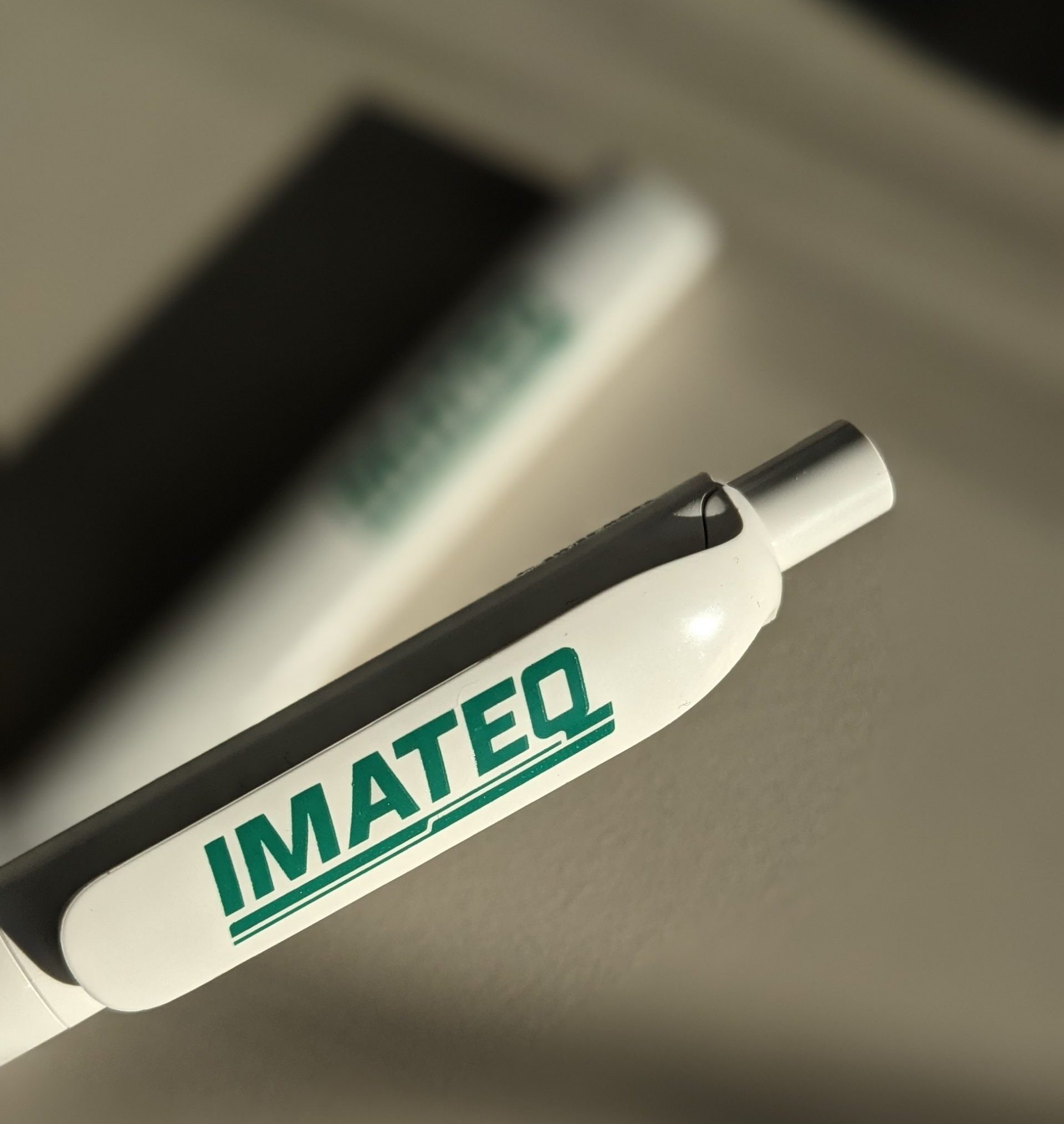
— Small mediums like pens, and other merchandise
— Stationary (business card, letterhead, presentation template)
— Content heavy platforms like website, brochure, presentations, reports, flyers; that can give context.
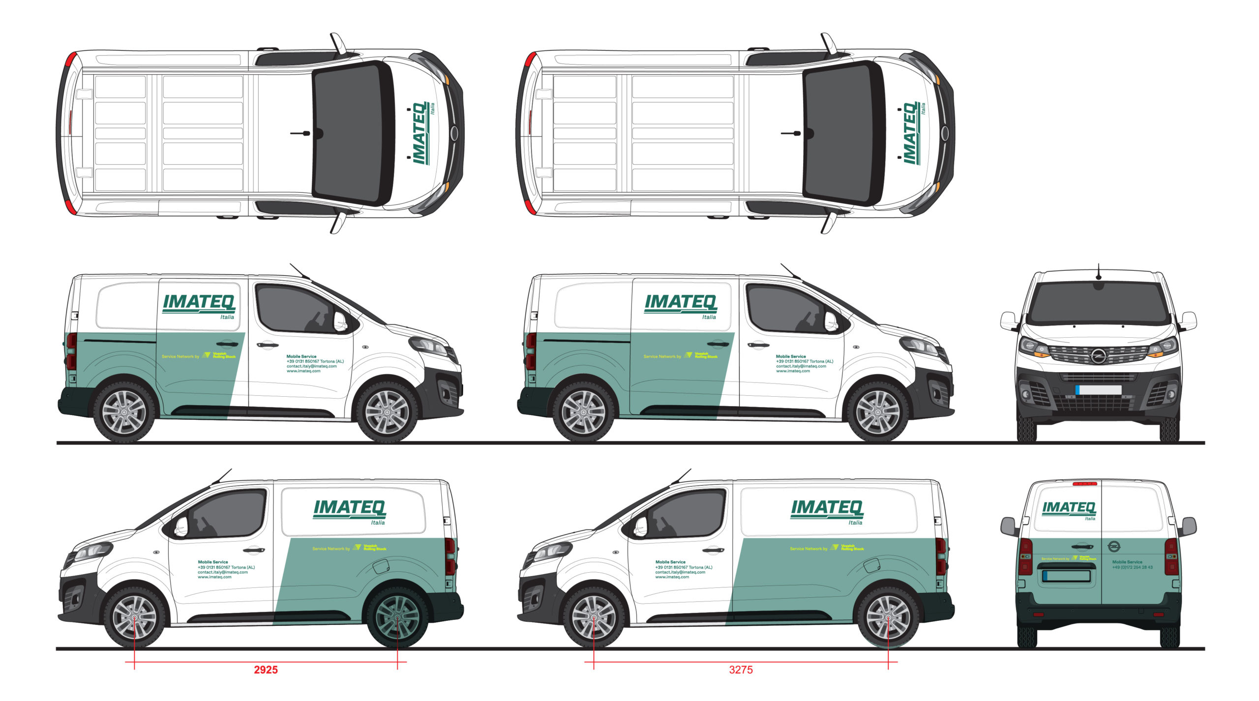
Only exception with the IMATEQ logo and add-on being on the left is when the format doesn't allow the content to be on the right. In this case, the back window layout of the car hinders us from following the rule so we make an exception.